The use of statistical models to both understand and forecast elections has moved from a cottage industry to a mansion industry during the last few U.S. election cycles, with many popular forecasting sites providing daily, sometimes hourly election forecasts throughout the campaign cycle (538, NYT Upshot, HuffPost Pollster, Bloomberg, and Daily Kos, to name a few).
For those of us lucky (unlucky?) enough to teach American politics and elections classes in the 2016 cycle, these forecasts offer instructors a chance to not only show students a reasoned, empirical prediction of the election, but also a chance to demonstrate how public opinion tracks over time in response to outside events, how long-term political identification such as partisanship drives behavior, and that national elections can be readily understood and predicted if done right.
I decided this year would be a perfect opportunity to show students “how the polling sausage is made.” I began writing my own election forecasting model in order to demonstrate to them that these (relatively) new centerpieces of American political coverage aren’t driven by magic or sorcery, but instead the application of transparent assumptions, sound statistical principles and political science research.
This is a fairly rudimentary model – I’m still learning! – in that it doesn’t account for historical state-by-state correlations, the national “swing,” and the like.
One thing I’ve been pleased to report to my students is that one of the best outcomes of the aggregate-polling industry and the mainstreaming of election forecasting has been the increased emphasis on polling averages rather than swings in individual poll estimates. The estimate of support for a candidate is a best guess at the state of public opinion within that sample, but we get a better idea of the “true” state of public opinion by aggregating polls.
There is a lot of noise within individual polls, whether as the result of sampling error, non-response bias, interviewer effects, and the like. Aggregating individual polls certainly isn’t a cure-all, but it does help to discern between actual polling trends and noise.
I typically weight polls as a combination of its age and sample size, with a half-life of 30 days (this means that 30 days after release, a poll has half the weight of a new poll with the same sample size). This also offers a way to demonstrate how weighting polls more heavily based on their “freshness” can lead to different trend lines. Take, for example, the aggregation of polls in North Carolina, weighting old polls less heavily (left; half-life of 5 days) versus more heavily (right; half-life of 30 days). In the left graph, the race looks much more dynamic, but mostly amounts to the trend line “chasing” new polls that are further out from the average (much of which is likely sampling variability and/or polling house effects).
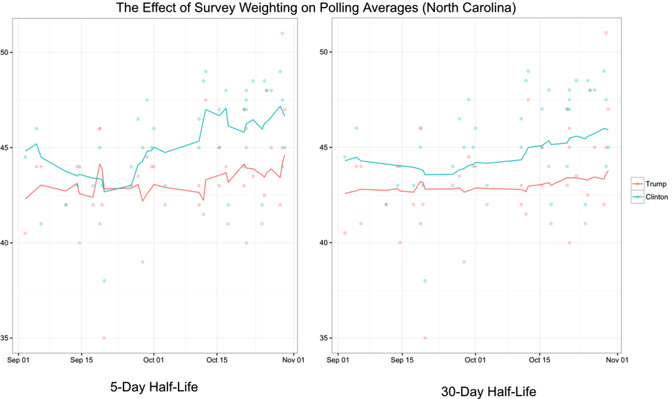
While there is a lot of evidence that Bayesian methods – notably (nerd alert!) Kalman Filtering – offer a better means to distinguish between signal and noise, I find that demonstrating aggregation through weighted averages is more intuitive, particularly to political science students who are not always mathletes.
Next, of course, comes simulating all state outcomes simultaneously, which is where we get to see the range of likely outcomes in the Electoral College. My model more resembles the 538 “NowCast” (what would happen if the election were held today?) than a forecast, because it does not predict out to election day. I’m working on that. That said, this model still demonstrates how election simulations work.
After deriving the most recent polling average, the model executes 10,000 random draws from a (nerd alert again!) Dirichlet distribution, a multinomial distribution generalized from the Beta distribution, based on the polling averages for the major party candidates, third party candidates, and undecided poll respondents in each state. These draws are then aggregated, with the percentage of draws where Clinton receives more support than Trump in each state equal to the probability of Clinton winning that state.
Finally, the national election is simulated 10,000 times using random draws from the Binomial distribution, which has only ‘0’ and ‘1’ values, corresponding to lose/win outcomes in each state, except for Nebraska and Maine since they split their electoral votes. Electoral votes in states that Clinton ‘wins’ in each simulation are counted up for each simulation and added to a distribution of possible Electoral College outcomes:
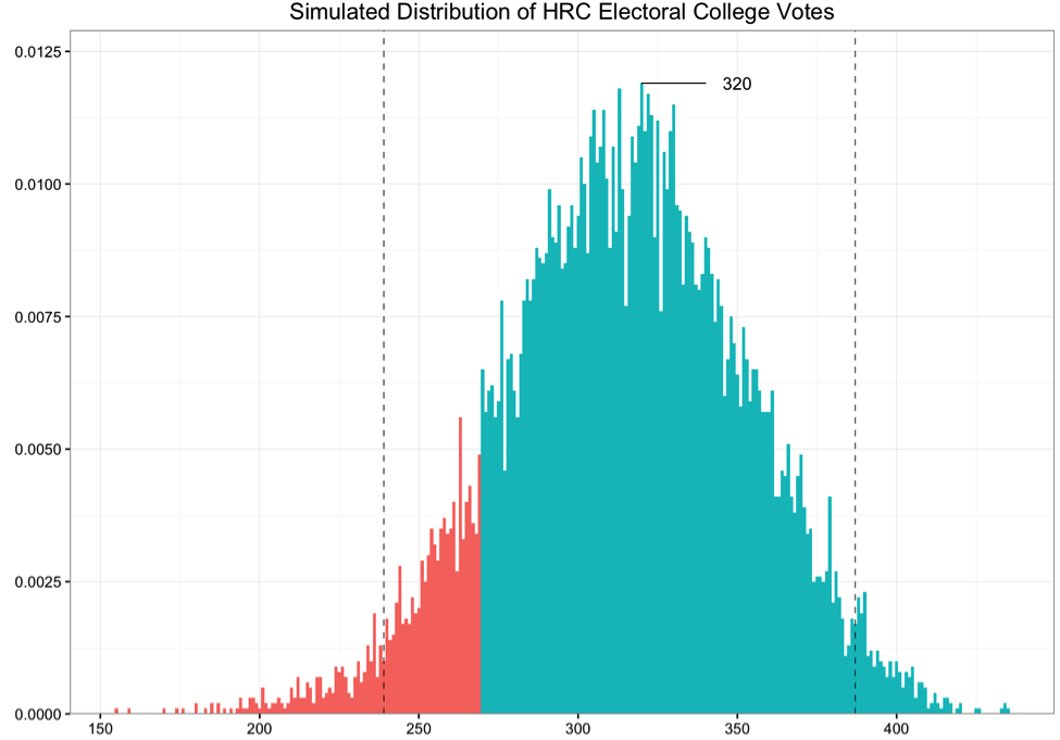
As of November 4, this model predicts that the most likely (modal) outcome of this election as 316 electoral votes for Clinton, with the Democratic candidate receiving 270 or more electoral votes in 88.3% of the 10,000 simulations.
Of course, this is not the most sophisticated election forecasting model, and readers would be served well to give attention to the myriad better-tested forecasting models out there. That said, I have found that showing how the basics of election forecasting work to students and other interested individuals has helped illuminate what often seems like incomprehensible to those outside of applied statistics domains.
Here’s hoping I learn from the performance of my estimates as compared to the results of Election Day 2016 to write a better forecasting model before the 2020 Clinton-Trump rematch. . . not that I’m forecasting a rematch.
Mike Gruszczynski is Assistant Professor of Political Science at Austin Peay State University. With his graduate school mentor, The Observatory co-founder Mike Wagner, he has published research examining media effects and politics in Journalism & Communication Monographs and Mass Communication and Society. He tweets @mikegruz